Of all the great mapping tools available on the Parks On The Air website (pota.app), this one is sorely missing. We’ll show you how to create a map of your activated POTA parks, which is great for showing off your activations to your other radio buddies. It also helps you keep track of which parks you’ve been to, so you can continue to expand your number of activated parks.
The following relies on free mapping technology:
BatchGeo, which has a free way to import Excel or CSV information and place the coordinates on a map. This needs to stay free in order for this guide to work. Other guides also reference Easy Map Maker, which has since taken away the ability to use more than 250 mapped points for free. I suppose that’s ok if you live in a small state or province. Alternatively, you can just pay them and then quit worrying if this is going to work tomorrow.
Google Maps can be used as an alternative mapping solution. It’s free, but obviously any use of a Google product comes with giving your data away to the big “G”. If you’re fine with that, it’s actually a better mapping strategy with more options.
MSU Amateur Radio Club’s POTAVis is a new solution that doesn’t require any data scrubbing. It’s a fast, simple, and beautiful rendition of a POTA activation map with absolutely no lag. Everything is rendered with JavaScript client-side.
Grab Your Data
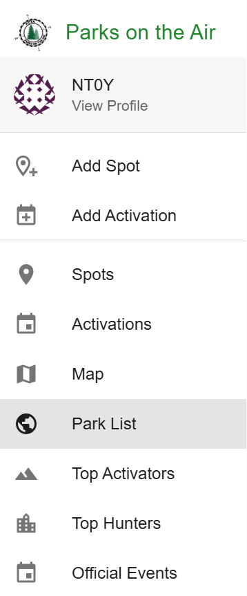
Navigate to the pota.app website, and log in. Next, go to the Park List from the hamburger menu on the left:
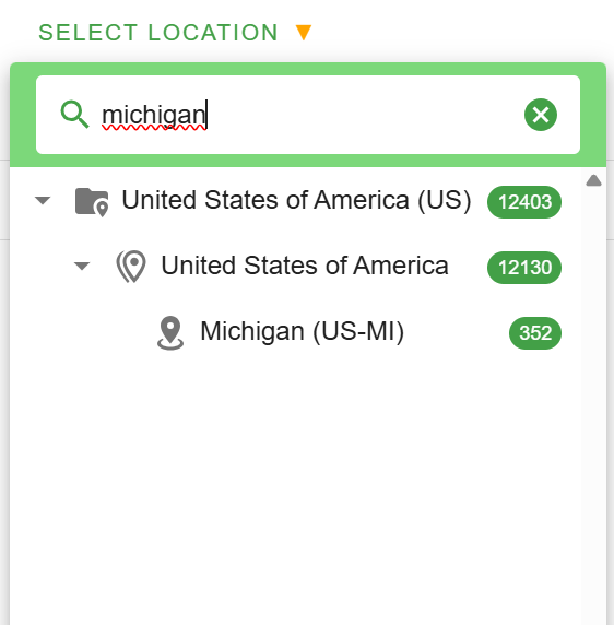
Next, search for the area you wish to map. In my case, I’ll search for my home state:
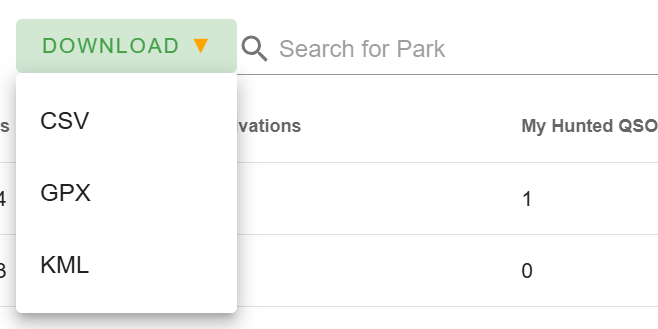
Once you click on your region, in the upper right-hand corner, select “Download”, then CSV.
If you’re using MSU ARC’s POTAVis, stop here and dump this CSV file into the app. If using Google Maps, skip to the Map Your Data: Alternative section.
Clean Your Data
In this instance, we need to clean up our data a little bit. Free mapping apps like BatchGeo don’t give you options for how many different colors your activations can be or how they’re grouped. It may randomly decide that anything between 0 and 3 activations are all a single color pin on the map, which would defeat the purpose of using the map to see what you’ve activated. Open your CSV file in Excel, Sheets, LibreOffice, or any spreadsheet app of your choice.
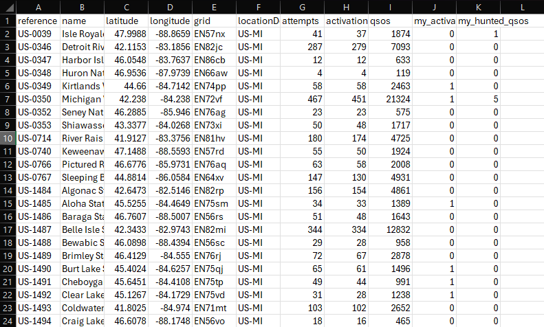
Column J is your number of activations in a given park. We need to make sure your map only displays your activated parks as two colors. A color for 0 and a different color for 1, which means we need to make sure only those two numbers exist in column J.
The first open column is where we’ll cleanse the data. in L2, type the following formula:
=if(J2>0,1,0)This means that if J2 is greater than 0, make L2 = 1. Otherwise, make L2 = 0. This will make any number of activations over 0, whether 37 or just 1, all equal to 1.
Grab the lower right-hand side of L2 with the extra dot on it and drag it down to the bottom row of the data in any column. In my case there are 352 POTA entities in Michigan, so mine ends at 353. This will populate that formula into all rows in that column.

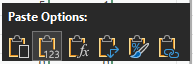
Next, press CTRL-C to copy those cells. Go all the way back to the top of the sheet, select column J2, right click,then select the icon for only pasting the values into column J. It appears as a clipboard with the numbers 123 next to it:
Right-click and delete all of Column L. Your data is now cleaned up. Hit save and exit Excel.
Map Your Data
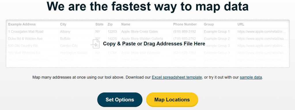
Head over to the BatchGeo site. Drag and drop your file onto the “Copy and Paste or Drag Addresses File Here” portion of the page.
Click “Set Options”
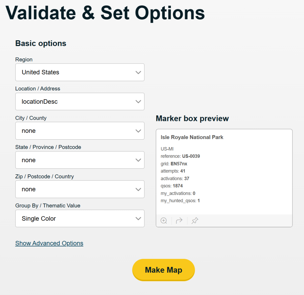
Change “Group By / Thematic Value” to “my_activations” then click “Make Map”.
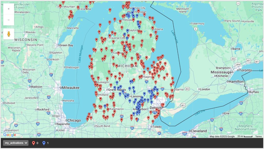
All done! So, in doing this for free, there are limitations. First, only the page on the BatchGeo site will contain this map. You cannot embed it in your own website. Second, it’s temporary. When you navigate away from this site, it’s gone and you’ll have to generate it again.
If you feel it’s worth it to be able to use this map more freely, support BatchGeo and subscribe!
Map Your Data: Alternative
If for some reason you want don’t want to support a smaller company and you’re ok with giving the big “G” your data, you can perform this same exercise in Google Maps. Navigate to google.com/mymaps.
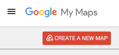
Click “CREATE A NEW MAP” in the upper left corner.

Select “Create”.
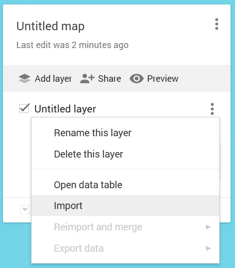
Click the three-dot menu to the right of “Untitled Layer” then click “Import”:
Browse for your scrubbed data file we prepared above, then make sure all of the following fields are checked:
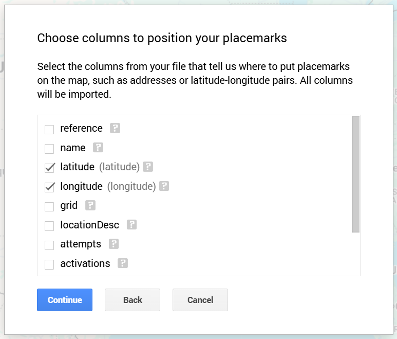
Click “Continue”.
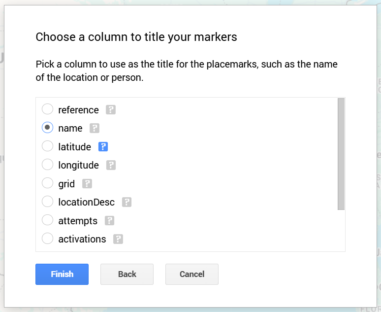
Choose a title for each marker. I chose “name”, which will display the human readable park name, but you could also choose the reference number if you wish:
At this point, you should see all your map points, but they’re all the same color. Click “Uniform Style” to change the color arrangement based on your data:
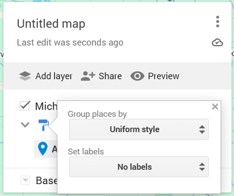
Under “Group places by”, click “my_activations”:
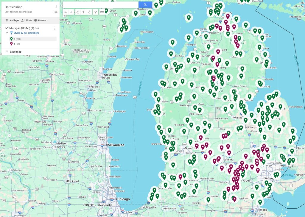
Bingo! From here there are various ways to share your map and it’s associated data. You can also change the color of the pins based on whether you’ve activated the park. I haven’t gotten into it, but you may even be able to use your non-scrubbed data file directly from the POTA site and manually set colors based on how many times you’ve activated. Play around and see what you can come up with.
https://www.google.com/maps/d/u/0/embed?mid=1xIYFtPcHNPe528bfFwDT5Qwf_3fYnc0&ehbc=2E312F&noprof=1
POTA Map Project Shoutout
The POTA Map project is also worth mentioning here, as it’s a version of what we manually complete in this guide, however, at the moment there’s no way to separate hunted from activated parks and there’s no customization to speak of. That being said, the potential is there.